Announcing the 2025 RMG Fridays Season

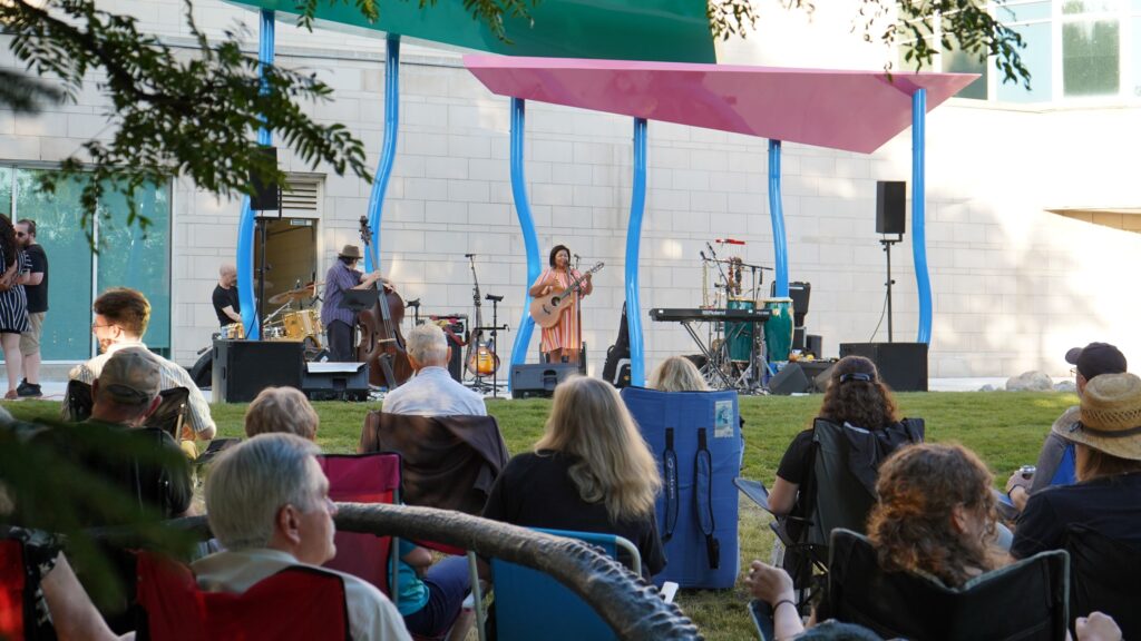
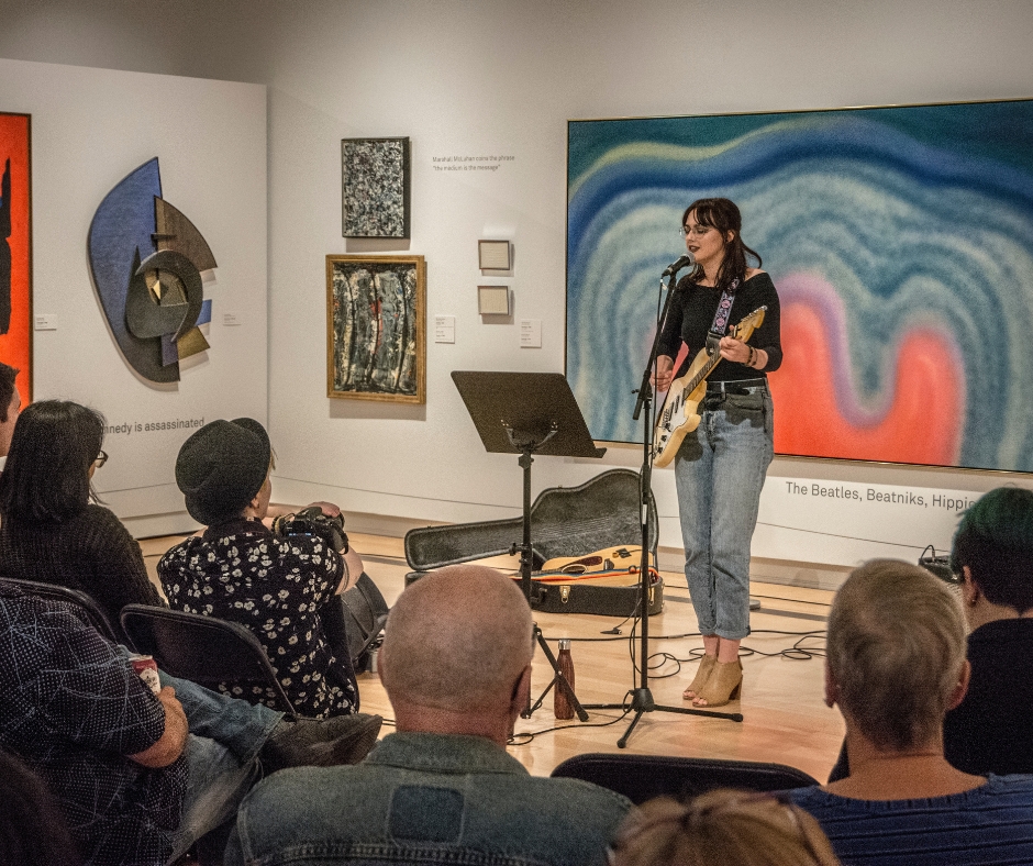
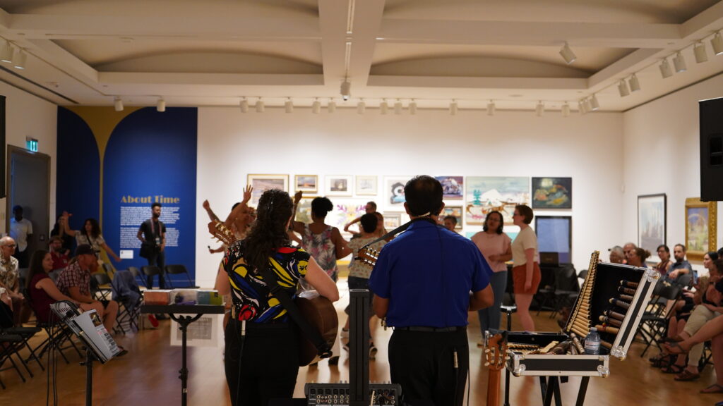
Welcome to 2025! We’re excited to share our plan for RMG Fridays this year. Between April and November, we will present five themed events welcoming a variety of community partners. Each event will offer live musical presentations, access to our galleries, opportunities to create in our art studio, enjoy food from local vendors, and more.

RMG Fridays will launch on April 4 in partnership with Oshawa Music Week featuring musical performances by students from the Music Business Program at Durham College. Our second event on May 2 will be a celebration of the thesis projects by the third-year graduating students of the Fine Arts Advanced program at Durham College.

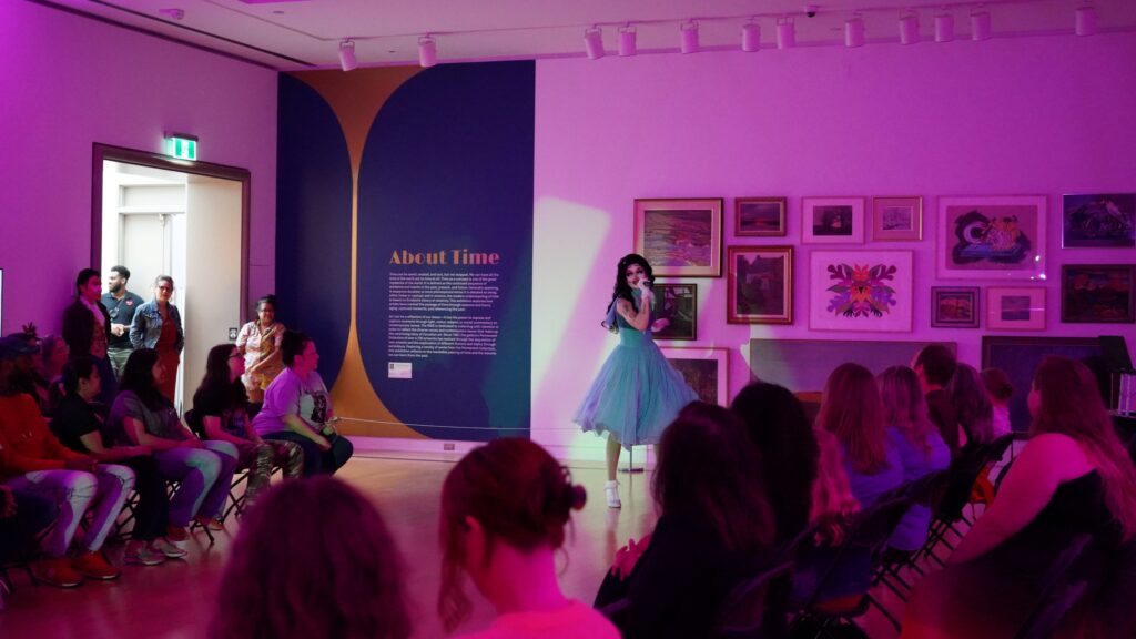
On June 6, we’ll host our annual Pride Celebration in our beautiful backyard. On August 8, From the Ground Up, will be a celebration of Indigenous Peoples Dance and World Cultural expressions from local groups around Durham Region.

On November 14, as part of the Bright & Merry Market, we’ll host a winter Fiesta featuring live music, dance classes, holiday market and workshops.

Thanks for your ongoing support of this series, we’ll see you here for the party!

Ontario Tech Community Pathways practicum students investigate digital accessibility!

During the months of July and August, the RMG’s Communications + Digital Engagement team hosted two students from Ontario Tech University’s Community Pathways Practicum Program. Each student explored an area of digital accessibility and presented their findings to the RMG team. Today, we hear from Harneak Burmi about the pros and cons of Artificial Intelligence vs manual alt-text for enhancing Search Engine Optimization (SEO) and web accessibility.

AI vs Manual Alternative Text: Enhancing SEO & Accessibility for Art Institutions

In 2019, Brooklyn resident Deshawn Dawson filed 37 civil lawsuits against various New York art galleries. These art galleries were in violation of the American Disabilities Act (ADA) because their digitized artworks did not accommodate the needs of persons with physical disabilities. Other residents had filed similar lawsuits, making up a grand total of 100 lawsuits filed against the state of New York. The residents’ biggest concern was the absence of alternative text in the galleries’ digitized artwork[i].

According to the Website Content Accessibility Guidelines (WCAG) 2.0, alternative text (alt-text) is defined as, ā€œnon-text content that is presented to the user as a text alternative that serves the equivalent purpose.ā€ Alt-texts are image descriptions that provide the user with relevant context of the image by touching upon an individual’s senses and evoking realistic visualizations. Manually written alt-text can act as a good replacement to the image’s default description.

For example, the University of North Carolina at Charlotte discovered the importance of using descriptive alt-text to promote their virtual art exhibition. The university formatted their entire website by manually writing alt-text for all their digitized artwork. They focused on formatting image descriptions so that the alt-text reflected the interests of their target audience. This information was extremely beneficial for viewers who were visually impaired as their electronic screen readers were able to describe the context of an image by reading out its alt-text. By restructuring the alt-text for their images, the university was able to create a more inclusive virtual environment and enhance user experience[ii].

Another advantage of having descriptive alt-text is that it can increase search engine optimization (SEO). There are multiple techniques that work in unison to produce optimal search engine results, based on the usefulness of website content. SEO ranking methods are not incompatible with web accessibility practices – both can work simultaneously and compliment each other.

For example, search engine crawlers are unable to determine the context of an image simply by visually scanning it. Instead, they rely on the image’s alt-text description to determine what is being presented in the image and where the webpage should be ranked in comparison to webpages on other websites that display similar content. As mentioned by Google’s image publishing guidelines, having manually written alt-text that enhances user accessibility can also achieve higher search engine rankings[iii].

Albert Einstein once said, ā€œthe measure of intelligence is the ability to change.ā€ Over the span of a few decades, humanity has armed itself with the most complex system of intelligence to date: artificial intelligence (AI). The breakthroughs in AI have increased the rate of productivity for many online businesses. Advancements such as object and person recognition software, machine and language translation, and automatic image colourization have made us reliant on these innovative technologies. Although, when it comes to sharing digital media content to improve both user experience and search engine rankings, relying on AI can be futile.

Thomas Smith, the CEO of Gado Images, mentioned that the inability to add meaningful and unbiased alt-text to digitized images is an inherent weakness of AI technology[iv]. For example, image prominent presentation software, such as Microsoft PowerPoint, are unable to integrate emotional connections that capture a person’s or an object’s relevance, expressions, and reactions in the alt-text description. Vague descriptions, like ā€œA picture containing person, outdoor, grass,ā€ are commonly written by AI machines upon examining an image. Such descriptions do not discuss the shapes, textures, colours, sounds and other elements that visually unimpaired individuals can see.

As a consequence, users who rely on assistive technologies, such as screen readers, are unable to create a full and accurate mental depiction of an image based on the AI alt-text. Additionally, search engine crawlers, which rely on alt-text to determine the purpose of an image and its target audience, will have trouble categorizing the webpage appropriately due to the lack of specificity in the description.

An inaccurate and unreliable automated alt-text description is just as ineffective as having no alt-text description at all. Therefore, creating manual alt-text seems like the better way to go. However, even manual alt-text has its flaws. Depending on the knowledge and expertise an individual who is writing the alt-text has, the possibility of writing a biased description is not entirely eliminated.

Unlike AI technology, humans have the capability of educating themselves on the specific contents of an image and rewriting alt-text descriptions that may be biased. In a rapidly transforming world, the human brain has evolved to become quite malleable and adaptive to the changes and pressures that exist when learning new ideas and applying those ideas in a practical sense, more so than current AI technologies.

Manual alt-text currently supersedes AI alt-text in its accuracy and reliability. Nonetheless, efforts by some organizations, like ā€œ Cloudsight,ā€ have been to use a hybrid approach by combining human intellect and AI machines to create more accurate alt-text descriptions. Writing human based alt-text has turned into a lucrative business as companies like ā€œScribelyā€ offer alt-text services to various brands, photographers, and artists. Scribely has specialized writers who work to improve accessibility benefits for all users and search engine rankings for many websites.

For art institutions, having a digital marketing team that is educated on both web accessibility and SEO can increase the return on investment in the long run by optimizing the perceptibility of art works for individuals who deal with visual impairments, yet still have a profound infatuation for visual art. The McMichael Canadian Art Collection is a prime example of how adding descriptive alt-text to digital art works can boost user experience for both visually impaired and unimpaired users.

Embracing the future of AI seems inevitable, but it is also a reminder for organizations not to be complacent and continue to have a hand in deciding what AI can do well and what tasks simply require more human connection and intervention.


by Harneak Burmi


[i] Watlington, Emily. ā€œHow Museums Are Making Artworks Accessible to Blind People Online.ā€ ARTnews.com, ARTnews.com, 22 Dec. 2020, www.artnews.com/art-in-america/features/the-met-mca-chicago-blind-access-alt-text-park-mcarthur-shannon-finnegan-1202677577/.

[ii] Sorrell, Melanie, et al. ā€œCreating an Online Scientific Art Exhibit Formatted for People with a Visual Impairment.ā€Ā Journal of Web Librarianship, vol. 11, no. 2, Routledge, 2017, pp. 105–23, doi:10.1080/19322909.2017.1300788.

[iii] ā€œGoogle Images Best Practices.ā€ Google Images SEO Best PracticesĀ |Ā Search CentralĀ | Google Developers, Google, 2021, developers.google.com/search/docs/advanced/guidelines/google-images?hl=en&visit_id=637612992999017808-606899786&rd=1.

[iv] Smith, Thomas. ā€œAI Is Terrible at Writing Alt Text.ā€ Medium, OneZero, 5 July 2021, onezero.medium.com/ai-is-terrible-at-writing-alt-text-e79b0c4ecf51.


The real driving force behind the Motor City

Image: Oshawa Classic Car Parade, 1971


News of the GM closure in Oshawa is difficult for our entire community. And that’s because it’s impact is bigger than the business, it’s about the community who built it.

Ā 

This is about a 100+ year relationship with an industry that a city shaped and found pride in and the people, families, and businesses who built themselves around it. Through the good and bad, we made this company a part of our community and our story.

Ā 

tbc 2506

Austin Show


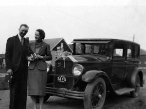
Images: Auto Magic Car Wash, 1950 (left), Royal Visit 1939 – Ches and Irene and Buick, 1939 (right)

This city has shown determination, conviction, and passion, and now it’ll be important to show caring and empathy for one another. As this piece of our history settles it makes room for the growth we’ve shown we’re capable of.

tbc 0708

Ā tbc 2236

Images:

The Oshawa Strike, 1937 (left)

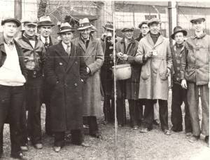
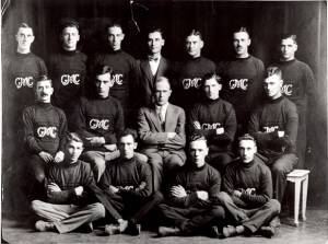
General Motors Softball Team, 1925 (right)


In Memory of Mae Nurse

As we make note of the passing of Mae Nurse on September 8th, we are reminded of her amazing support of the arts. Mae’s dedication is obvious each time we walk into the RMG and look at the soaring glass in the foyer (named in honour of both Mae and her husband, William, who we knew as Bill) and the well-appointed gallery spaces of the Arthur Erickson building.

Mae had been a dedicated gallery volunteer since the 1970s, but she will be most keenly remembered as the Chair of the Building Committee of the 1987 gallery renovation and expansion. For over three years, she and Bill, who was the Campaign Manager, worked tirelessly to make the dream of an enlarged gallery space a reality not only for the citizens of Oshawa and Durham Region, but for those who continue to visit from across Canada, as well as internationally. She was a rare combination of being both a visionary and one who knew how to get things done: many of the building’s fine details are undoubtedly due to Mae’s persistence and tenacity. Along with her time, she and Bill (who passed away in 2016), were generous in their financial support of the gallery, helping to make the visual arts accessible to so many of our visitors.

Mae’s legacies are many including her children and grandchildren, as well as her many friends. She also supported artists and her and Bill’s art collection is a tribute to that support. We at the RMG will always remember her not only for the generosity of her time and skill in transforming the gallery some thirty years ago, but as a lifelong friend of the arts.

Meet the instructor: Angela Hennessey

Angela HennesseyĀ is a local printmaker who we’re excited to work with to present a printmaking workshop this fall inspired by Luminous John Lander. We thought we’d learn a little more about Angela, her practice, and the value of instructing.

Why Printmaking?
I’m a process and procedure person – printmaking is all about the process, the end result is almost unimportant.Ā  The scope of the many different techniques that can be employed is endless.Ā  I’ve been printmaking exclusively for the past 9 years and still haven’t tried all the permutations and combinations that are possible!Ā  Because I bore easily, I really need variety in my work – printmaking allows that “in spades”!

What’s your favourite thing about teaching art?
Getting the student to be as excited about the process as I….. seeing their delight at the results of their efforts!
 

Do you have a favourite artwork?
If you mean – in all the world – Tom Thomson’s “The West Wind” – it evokes my childhood, my parents admired him greatly and that was passed on to me.Ā  My family would go camping in Algonquin Park every summer, a wonderful experience for me.
 

What can participants look forward to in your upcoming class?
Participants will learn the pleasures of cutting the soft lino – it’s quite “buttery” – and then will print a small edition of their unique image.Ā  Best of all, they will have the printing plate to take home, where they can continue to make prints, as this method doesn’t require a press!
Click here to learn more about Angela’s upcoming workshop.

John LanderĀ Ā Ā Ā Ā Ā Ā Ā Ā Ā Ā Ā Ā Ā Ā Ā Ā Ā Ā Ā Ā Ā Ā Ā Ā Ā Ā Ā Ā Ā Ā Ā Ā Ā Ā Ā Ā Ā Ā 

Image: John Lander in his studio, 1986

By Joan Murray

Ā Many years ago, when I was first made director of the Robert McLaughlin Gallery in Oshawa, John Lander, while still a student at York University in Toronto, showed me his work. I immediately recognized its unique quality. That remained the factor that distinguished his work throughout the years of his life. When he died in 1992, his art was still arresting compared with the art being made around him. Among the many ways in which he differed from his fellow artists in Canada was that where they might paint landscape or somehow echo it in their work, his art concerned mostly one subject, still life.

In other words, his images were of Nature, but remotely. He was a poet of the particular, the recognizable, in a subject he loved, flowers in the domestic realm.

This sense of the beauty of such a fragile subject, so varied and so tender, led Lander into a calculated risk, that of being typed as a flower painter, and therefore somehow secondary. That would have been a false impression for he had searching visual powers that delighted in the unusual shapes of both blossoms and vases. It was true that he loved them, and sought their forms with a deeply sympathetic insight, but he conveyed them with wit and a natural flair for elegance. They inspired his sense of design and very special use of colour.

The power to absorb and to set down images came to him only gradually, through a long process of decision-making and work. Lander initially went about it the following way: first, he bought flowers, then arranged them in a vase, then drew them many times, editing his drawings as he proceeded until he had a master drawing to compose a silkscreen print. In time, instead of drawing, he used slides of the flowers and of suitable vases or containers and edited them into a template for his work. Sometimes, the flowers and vases only met in his prints.

He began with the familiar flowers of daily life – gladioli, day lilies, poppies – and later moved to more exotic anthuriums, agapanthus, and birds of paradise.

The work which most deeply pleased him at this time in his work was his Coloured Dogfish print. It was a bouquet of anthuriums in a long narrow vase with a fish on it. Gentle, it was at the same time, humorous and stylish.
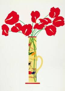
johnlanders_coloureddogfish

Coloured Dogfish (1978) Silkscreen

Something about the long process involved in making his silkscreen prints reminded Lander of the vanished joys of childhood, of times he and his family shared at their cottage at Lake of Bays, where he could paint paint-by-number pictures and work at his coloring books endlessly.

Born in Oshawa, he knew it well. He had played in Oshawa Creek as a child.

For public school, he had gone to Dr. S.J. Phillips and for high school, O`Neill Collegiate. Then, like many from Oshawa, he went to York University in Toronto. There, from 1970 to 1974, he took art and learned in the studio how to paint and, most important of all, how to make silkscreen prints with David Samila.

As Lander admitted of himself later, he could do art better than he could do anything else. He couldn`t throw a ball to perfection, and had no interest in this sort of competition, but he could do art.

His favorite books as a child had been C.S. Lewis`s Narnia series. Their sense of fantasy meant a lot to him and he always remembered them with pleasure.

He took a long period of time to find his path, working first in a studio in Oshawa, above the Jury & Lovell Drugstore at the Four Corners, then in Toronto, at Open Studio, but by the late 1970s, with the help of his dealer, Nancy Poole`s Gallery, his prints and posters were everywhere.

In 1981, when he moved to New York, his work changed in its medium, but not in its nature. His expanded the subject he loved, flowers, and tied them together with other evocative objects with which he felt they had some sort of relation. Exhausted by the flower-in-vase theme he`d used, he investigated still life.

Now he placed his flowers in window boxes or in their surroundings in a room – on top of a buffet, against a scarf or a kimono, on top of a lace tablecloth. He began to add furniture – a clock on a table, a settee, twin beds. He might introduce a quality of playfulness by adding tiny figurines.

The subjects were almost novelistic; the objects interacted like actors in a play.

He rendered the images in painstaking detail and with delicate precision. He had become more comfortable with realism and the tradition of painting.

The apparently effortless manner in which these works were painted should deceive no one as to the intense care that went into his craftsmanship and his great skill in painting.

By now, he had achieved what some artists hope for all their lives. His work was carried by a major New York gallery, the Fischback Gallery, then on 57th street. Known for showing the first Solo shows of what later became world figures, it had switched its emphasis from avant-garde art to realism in 1980. Fischback bought one of Lander`s paintings for its own collection and placed Lander`s work in group shows, then in 1989, gave him a one-person show.

Some would write of the great development in his work.

My own feeling is that much of his work appears as witty and compelling as it did when it was made and that Oshawa once had a grander future in view, because John Lander was born there.
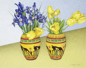
Tulips and Iris in Antelope Vase (1989) Watercolour and graphite on paper Gift of Ella and Ward Irwin

Tulips and Iris in Antelope Vase (1989)
Watercolour and graphite on paper
Gift of Ella and Ward Irwin

(An Exhibition of John Lander, Luminous John Lander: Landscape, Portrait, Still Life, will be on view at the Robert McLaughlin Gallery in Oshawa, September 29 – December 9, 2018)


(Joan was Director of the Gallery 1974-1999. When Lander died, she made a lithograph in his memory, Dead Duck (from the Say Goodbye series), and gave it to the Gallery)


Painters Eleven and Oshawa

By Joan Murray, Director of the Robert McLaughlin Gallery, Oshawa (1974-1999)Ā  Ā  Ā  Ā  Ā  Ā  Ā  Ā  Ā  Ā Ā 

When people fund art galleries, they seek to unite artworks they value under a single roof.

Ewart McLaughlin, who provided the funds for the building of the Robert McLaughlin Gallery, played a similar role. He established the Gallery building in 1967 with, as its base, forty-seven works that had been collected by Alexandra Luke, his wife, a member of Painters Eleven, who had died that year. As well as being a member, she had been one of the most ardent supporters of the Group and had supported all the arts life-long.

Her collection reflected her interests. It is eclectic, with handsome examples of Painters Eleven, some of them dazzling like William Ronald`s mysterious Darkness No. 2 with its sense of light shining from depths or Ray Mead`s Bouquet.

In the early 1970s, the question of the Gallery`s guidelines came up. The then director, Paul Bennett, set them. He wisely chose – no surprise – Painters Eleven.

He discussed it with me in 1972 at the Art Gallery of Ontario, where I was the first Curator of Canadian Art.

ā€œIt`s a great idea,ā€ I said.

At the time, Painters Eleven, the first abstract painting group in Ontario, was the only group founded in Oshawa. It was officially formed in 1953 in Oshawa, in the studio and summer home of Alexandra Luke at Thickson`s Point, the result of the Abstracts at Home show, held at the Simpson’s department store in Toronto that October.Ā The members included, listing them alphabetically, Jack Bush, Oscar CahĆ©n, Tom Hodgson, Hortense Gordon, Alexandra Luke, Jock Macdonald, Ray Mead, Kazuo Nakamura, William Ronald, Harold Town, and Walter Yarwood.

They seemed at the time, to each other and later, to members of the art community such as myself, to be an exciting, even crucial element in Canadian art.

I had an additional reason for liking them. I had the benefit of seeing their work, and work like it, at the Riverside Museum in New York. The American Abstract Artists invited Painters Eleven to exhibit with them at the museum in 1956.

When I became director of the McLaughlin Gallery in 1974, Charles McFaddin, the Registrar of the Art Gallery of Ontario and my friend, gave me a Nakamura for the collection. Although small, it was important since it had been included in an actual Painters Eleven show (the second, at Roberts Gallery in Toronto.)

Charles said he`d only give it to me if I promised to maintain the guidelines as Painters Eleven.

I promised.

To learn about them, I interviewed the living members, and the widows of those that had died. I accumulated their work for the collection. Some fine things had been bought before my time by Kay Woods, formerly the curator. She bought Harold Town`s major painting The Bridge, but I added where I could and through shows and publications began to bring the work the attention it deserved.

Showing Painters Eleven wasn`t always easy. A man came into the gallery, looked at the exhibit and said, ā€œThis guy sure changed his style a lot.ā€ Even the Board of Trustees had their doubtful moments. ā€œI wouldn`t give a dollar for that work,ā€ said one Board member, waving at a Jack Bush.

But, in time, there was more acceptance. By the second half of the 1970s, our guidelines were well known enough that works by the group even were given to the collection. One such work was Hortense Gordon`s happy Colour Study (1960) which Walter Moos of Moos Gallery in Toronto gave in 1979 with the words, ā€œIt has no commercial value.ā€ In other words, he couldn`t sell it so he was giving it to the gallery.

Today, with the general admiration felt for the group, many would disagree.

In the future, besides a rising price to the works, I expect new adherents to Painters Eleven. There will be a greater comprehension of their place in Canadian art history, more publications, and more works at auction. In other words, the fate we have seen of the Group of Seven, will be theirs also.

Journey is a title the Group used often. Another was Adventure. In their paintings, they were always seeking, travelling, reaching out for the impossible.

To be on the side of this new faith is an adventure for all that make it.

Joan Murray,

Director of the Robert McLaughlin Gallery, Oshawa (1974-1999)

Meet David Wysotski!

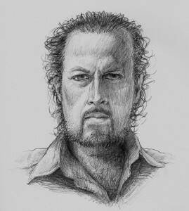
Self-portrait by David Wysotski

Self-portrait by David Wysotski

David Wysotski is an illustrator and artist painting in both traditional and digital mediums. Last year, Dave taught a drawing/painting class at theRMG which we’ve brought back by popular demand for the third time this season! We thought we’d learn a little more about Dave, his practice, and the value of instructing.

1. Tell us about your artistic practice.
My current artistic practice is fine art based; painting from the heart, painting with meaning, painting what excites me. That focus is a great shift from my career these past few decades where I’ve worked as a natural science illustrator, creating artwork to satisfy client’s needs. As much as I have enjoyed illustrating nature for commercial purposes, I’m excited to have my career transition from illustrator to fine artist.


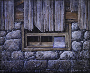
A sample painting David did as an example for his most recent class.

A sample painting David did as an example for his most recent class.

2. What’s your favourite thing about teaching art?
My favourite thing about teaching art is problem solving. I enjoy the challenge of assessing each student’s works-in-progress and helping them trouble shoot ways to achieve greater results. When I can come up with possible solutions that they may not have considered, I’m rewarded by knowing I’ve helped. I’m also drawn in to the passion and thirst for knowledge that many of my students bring to the classroom. Teaching those that have a desire to learn is what keeps my enthusiasm high.

3. What’s your favourite artwork? Why?
I’ll never be able to choose a single artwork as my favourite as I have way too many favourites! What I can tell you though is that my favourite genre is portraiture. Some favourites would have to include portraits by Rembrandt, Klimt, Bouguereau, Sargeant, Bacon, Vermeer….the list is long. I’m drawn to both realism as well as expressionism. Some of the contemporary portrait artists I’m enjoying lately are successful at combining those differing tight and loose styles. Current artists like Jeremy Mann, Daniel Sprick and Russ Mills excite me for that very reason.

4.Ā What can participants look forward to in your upcoming classes?
My classes include lessons, demonstrations and lots of one on one guidance in a calm, positive atmosphere. Ā Beginner painters can look forward to improving their drawing ability and learning how to work with acrylic paints. Ā Intermediate painters can look forward to gaining new knowledge, skills and techniques. Ā I aim to have my students achieve a recognizable improvement over the duration of my classes. Ā Ultimately, a class that includes learning, laughing, relaxing and creativity makes for a fun evening for all, myself included.

Click here to learn more about Dave’s class!

#FeelsLikeHome

Image courtesy of Stephanie Pollard. The image is from Stephanie’s 13th birthday party, which doubled as a goodbye party for heading to Canada, 2002.

By Stephanie Pollard

When my family and I immigrated to Canada from Jamaica in 2003, my mother worried about how we would celebrate our first Christmas in our new home. All we knew – including aunts, uncles, and our two grandmothers, would be 3,028 miles away. Fortunately, we had each other, and my mother found a Filipino grocery store that also sold Jamaican ingredients for Christmas cake and ham. My mother made our first Christmas in Oshawa feel a bit more like home.

Fast-forward 15 years (and two Jamaican grocery stores), the Robert McLaughlin Gallery asked residents what feels like home, and to send pictures of those reminders. Alongside those reminders will be the Thomas Bouckley collection, 4,000 photographs of what his Oshawa looked like over 100 years ago. Curator Sonya Jones explained the project came from the idea of seeing art being created from a point of view en masse, part curiosity and part professional ethos.

ā€œCommunity engagement is a huge curatorial philosophy for me…in the past when I had done similar projects, I’ve asked viewers to respond to pieces like the Thomas Bouckley collection, or works from (the gallery’s) permanent art collection…this time, I’m going to be responding to what the community does by exploring this really beautiful idea of home, and how it can be so many things (to many people), I like the idea that home and community can be merged into one,ā€ Jones said. While sorting through the submissions Jones found a few threads that keep home and community together: candid shots of family, pictures of food, views from a special place, a favourite room in the house, even images of places traveled to, all highlight the need to belong safely. Such a need, even in the form of a community art piece, isn’t exclusive to a specific group of people.

ā€œ…Usually with the historical photographs, I get a lot of response from seniors – the demographic who tend to be really passionate about history… but I’m also getting young people, people all across the map in terms of demographic and that has been a happy surprise,ā€ Jones said.

Chances are, some those images are coming from people who are going through the process of making Oshawa their home, and other images from those who spent time navigating worlds away from home. The feelings behind the circumstances are one in the same – we all long for belonging, regardless of what it took to arrive, or return. And a community that feels like home takes us all in stride: one moment, one day, one image at a time.

#FeelsLikeHome will be on display at the RMG until August 26, 2018. Click here to learn more about #FeelsLikeHome and submit your images.

Linda Jansma: Curator Extraordinaire

by Joan Murray

A curator`s task differs from person to person. For some, it means gathering a collection. For others, interpreting what is already there. For all, it means study of a chosen field, say trains if you are the curator of a railway museum. Then you dedicate yourself to preserving the physical legacy, history and experience of rail transportation within a chosen area.

At the Robert McLaughlin Gallery, the chosen field was more amorphous because it was Canadian Art, but only within a specific time frame, say the 1880s till today, and favoring a specific place, Oshawa and the region of Durham. Of course, choosing such a region meant choosing the influences on the art of that region, which could be quite wide and ranged from the Group of Seven and Painters Eleven, the main group founded in Oshawa, to artists of interest, though usually Canadian, everywhere.

A curator at the Gallery had, therefore, wide parameters. They also had limitations. As is usual in a regional gallery, these meant a meagre purchase budget. They also meant persuading the Purchase Committee of the wisdom of your choices.

Linda Jansma was at the Gallery twenty-eight years during which she battled against the boundaries, fighting to maintain professional standards and saving up her modest resources so that the collection was conserved and preserved properly.

She was not alone in her task, but she was essential, first as Registrar, then as Curator.

ā€œCuratorā€ comes from the Latin word curare, to care for. The curator cares for the collection, and that includes enhancing it, whether by gift or the magic of scholarship. Jansma expanded the understanding of the collection by organizing a major retrospective of Rody Kenny Courtice, a wonderful early modernist and friend of an artist important to us, Isabel McLaughlin. She added to our knowledge of another artist, Jock Macdonald, a member of Painters Eleven, by discovering a treasure trove of his early work in Glasgow. She interpreted it in the catalogue of a major show on the artist in 2014 at the Vancouver Art Gallery and was awarded the prize for best curatorial writing that year as a result. She also interpreted the work of several artists today who are of great interest, such as Ed Pien (known for his drawing-based installations), the challenging artist Nell Tenhaaf, and the collaborationists Jennifer Marman and Daniel Borins, organizing exhibitions of their work. She was on what is called the lead in her selection of these artists, or in the forefront of the realm of curators.

As for purchases – she loved the fact that she was involved in commissioning public sculpture by Mary Anne Barkhouse, Reinhard Reitzenstein, Doug Coupland and Noel Harding, as well as recent purchases of work by Sarindar Dhaliwal and Tazeen Qayyum.

She was as well as a champion of the important and interesting figures in Canadian art today, a person of inexhaustible energy.

Her work called on her enthusiasm and– and her intelligence. So often, if you went in her office, she was effervescent, and you were revived.

Long ago, in 1989, when she was hired, I knew Jansma could weather all difficulties when I heard that she had chosen as cover of our wedding invite, a drawing by Ray Mead that I`d curated into an exhibition. Her choice reflected her faith in art. From the moment I heard about it, I believed that she would be a great choice for a staff member.

In wonderment, these many years later, I realize I was right.

-Joan Murray